Welcome to ConceptMappR!
ConceptMappR is a Shiny dashboard designed to help students and teachers draw, analyze, and compare concept maps. The development of ConceptMappR was funded by Innovedum to advance education at ETH Zurich.
If you are here for the first time, please have a look at the information provided under Readme. Otherwise you can directly continue to Draw to draw your own concept map or to Analyze if you already have a concept map prepared for analysis (example files: Primary / Comparison).
As a student, please contact your teacher for questions about the content of the maps. If you experience any technical issues or if you have any questions about network analysis in general, please contact Christian Thurn.
Thank you for using ConceptMappR!
If you want to provide feedback to this tool and help evaluating and improving it, you can answer this survey.
Readme
What is this dashboard for?
This dashboard allows students and teachers to visualize, analyze, and compare concept maps. The overall goal is to improve learning by providing a clear and informative display of concept maps. Using network analyses, the tool helps to effectively evaluate concept maps in a few simple steps.
Who is this dashboard for?
On the one hand, ConceptMappR is intended for students to facilitate constructive learning processes by analyzing their own concept maps and comparing them to other maps. To ensure flexibility, this 'comparison map' can be any concept map: It can be a map a student created at an earlier stage (e.g., before a learning unit), a map of a colleague on the same subject or a curated 'expert map' provided by a teacher.
One the other hand, ConceptMappR is intended for teachers. The dashboard allows to upload multiple maps (e.g., a set of maps created by a class) to create an aggregated map, highlighting unique, shared, and critical nodes and providing a way to investigate how the network structure of a class might look like.
Concept Maps, Networks, Nodes & Edges
Concept maps are a method of visually organizing knowledge to stimulate deep, constructive learning processes on the one hand, and to capture learners' knowledge and misconceptions on the other: They can thus be both a support method and a formative assessment method.
Concept maps visualize concepts and their relationships as a network of nodes (also 'vertices') connected by edges (also 'lines' or 'arrows'). The difference to mind maps is that all relationships must be justified and multiple central nodes may exist.
For illustration, the following figure shows an articial concept map with nodes 'NodeA', 'NodeB' and 'NodeC' connected by the edges 'Edge1', 'Edge2' and 'Edge3':
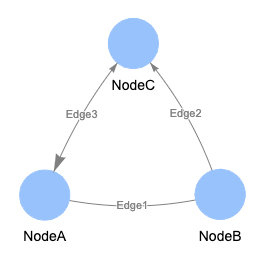
Using concept maps is challenging for teachers due to difficulties in interpretation and costly analysis. Current analysis methods involve heuristics and subjective impressions, making it challenging and non-scalable, particularly in large classes. As concept maps represent networks, this dashboard assists learners and teachers in evaluating concept maps, using network analysis methods for a more objective assessment.
Import (Upload)
If you draw your concept map with ConceptMappR, you do not have to worry about file formats, since the exported file can be analyzed without any adjustment (see Draw).
However, if you create your map any other way, these are the file formats that are currently supported:
- Text files with file extensions *.csv, *.tsv*, and *.txt with columns separated by semicolon (;), comma (,) or tabulator (example files: Primary / Comparison).
- Microsoft Excel files with file extension *.xlsx.
- CmapTools files with file extension *.cxl.
The basic structure of the text and Excel files is a so-called edge list. Importantly, they must contain exactly three to four columns and have no header (i.e., no column names). Let us illustrate the file structure with the following artificial map:

- The first column contains the names of the 'source' nodes (i.e., 'NodeA', 'NodeB', 'NodeC').
- The second column contains the labels of the edges connecting the nodes mentioned in the first and third columns (i.e., 'Edge1', 'Edge2', 'Edge3'). The edge label can also be an empty string.
- The third column contains the names of the 'target' nodes (i.e., 'NodeB', 'NodeC', 'NodeA')
- The fourth column is optional. It can be used to specify the direction of the edges. When the value is '0' (or when no text or no fourth column is provided), the edge is drawn without arrowheads. When the value is '1', an arrow from the source to the target node is drawn. When the value is '2', a bidirectional arrow is drawn.
Thus, the above concept map would look like this in tabular format (example files: *.csv / *.xlsx):

Export (Download)
You can export (download) your drawing and the information displayed in the dashboard. You have the option to choose between different Output File/s:
- Map Structure (*.cxl): This file represents your drawing / map including formatting and node positions using the format specified by CmapTools. It is most suited to export your drawing or if you want to further customize your map in CmapTools.
- Edge List (*.xlsx): This file represents your drawing / map as an edge list (see Import (Upload) for an explanation). Thus, it does not include node positions or formatting.
- Analysis (*.xlsx): This file is only available under 'Analyze'. It contains a summary of the analysis and information displayed in the dashboard.
- Pixel Graphic (*.png) / Vector Graphic (*.svg): These options export the displayed maps as images. The vector graphic (*.svg) can be further edited in a compatible software. Please note that exported images will look slightly different to the interactive maps shown in the dashboard.
You can either select a single or multiple output files. Click on 'Download' to save the file. If you have selected multiple files, a *.zip file is returned.
Draw
One major obstacle in analyzing concept maps in teaching, especially in larger classrooms, is the lack of a seamless integration between drawing and analyzing. ConceptMappR includes basic drawing functionality directly in the dashboard under Draw (but see below for dedicated drawing software). This is how it works:
- Click on 'Add Node' and on an empty space to create a new node.
- Click on 'Add Edge' and draw a line from one node to another to create a new edge.
- Select a node and click on 'Edit Node' to edit the label, size or color of a node.
- Select an edge and click on 'Edit Edge' to add / edit the label, arrowheads ('0' for no arrowheads, '1' for arrows from source to the target node , '2' for bidirectional arrows), width and color of an edge.
- Select a node or an edge and click on 'Delete selected' to remove it.
- Shortcuts: 'N' to add nodes, 'E' to add edges, 'double click' on nodes / edges to edit, 'D' to remove the selected nodes / edges
- We highly recommend using a device with a larger screen, mouse and keyboard. When drawing on a mobile phone or smaller screen, you can click on the button to make the canvas bigger.
The dashboard also provides two options to help you setting up your drawing. First, you can upload a list of nodes (example files: *.csv / *.xlsx) which will populate the canvas with nodes allowing you to focus on drawing the connections. Second, you can also upload an existing concept map (see Import (Upload)) which you then can edit. Importantly, you can download your map by selecting the Output File/s and clicking on 'Download' (see Export (Download)).
There are two options to analyze your drawing: In the 'Analyze' tab, you can either upload the exported Map Structure (*.cxl) or Edge List (*.xlsx). Alternatively, you can directly retrieve the current drawing without the intermediate export step (see 'Analyze: General' in the Readme).
Another option to draw concept maps is to use a dedicated software such as CmapTools. CmapTools is freely available, runs on most major platforms, and even provides a cloud-based version that can be used without installation. However, please be aware that the cloud-based version will store your data on their servers. To keep the hurdles as small as possible, you can export your Cmaptools map as a *.cxl file which can then directly be imported into ConceptMappR.
Still, sometimes nothing beats drawing on paper or using the software you know. In these cases, you can still use ConceptMappR if you are willing to translate the map into the formats outlined in the box 'Import (Upload)' or to redraw your map with ConceptMappR.
Analyze: General
The first step under Analyze is to provide the data (example files: Primary / Comparison). In the sidebar on the left, you can select Source of the Primary Map, i.e. whether you want to upload a single or multiple file(s) as the Primary Map (see Import (Upload)) or if you want want to use the current drawing (see Draw). When uploading Primary Files, you can click on 'Select file...' to open the file selection dialogue allowing you to select a single or multiple files (hold Shift or Ctrl to select more than one file). Optionally, you can also upload a single Comparison File to which the Primary File(s) are then compared to. Once you click on 'Analyze', the dashboard will perform the analysis and restructure depending on whether a single Primary File, multiple Primary Files, and a Comparison File was uploaded.
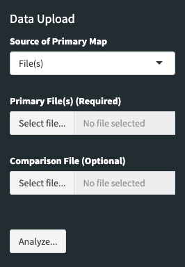
The sidebar on the left now shows several options to customize the display and the analysis. More information about these options is provided below (see Analysis: Centrality and Analysis: Matching Options) as well as in the tooltips appearing when moving your mouse cursor over each option. You can return to the screen where you can upload your data by clicking on 'Change'. You can download the information displayed in the dashboard by selecting the Output File/s and clicking on 'Download' (see Export (Download)).
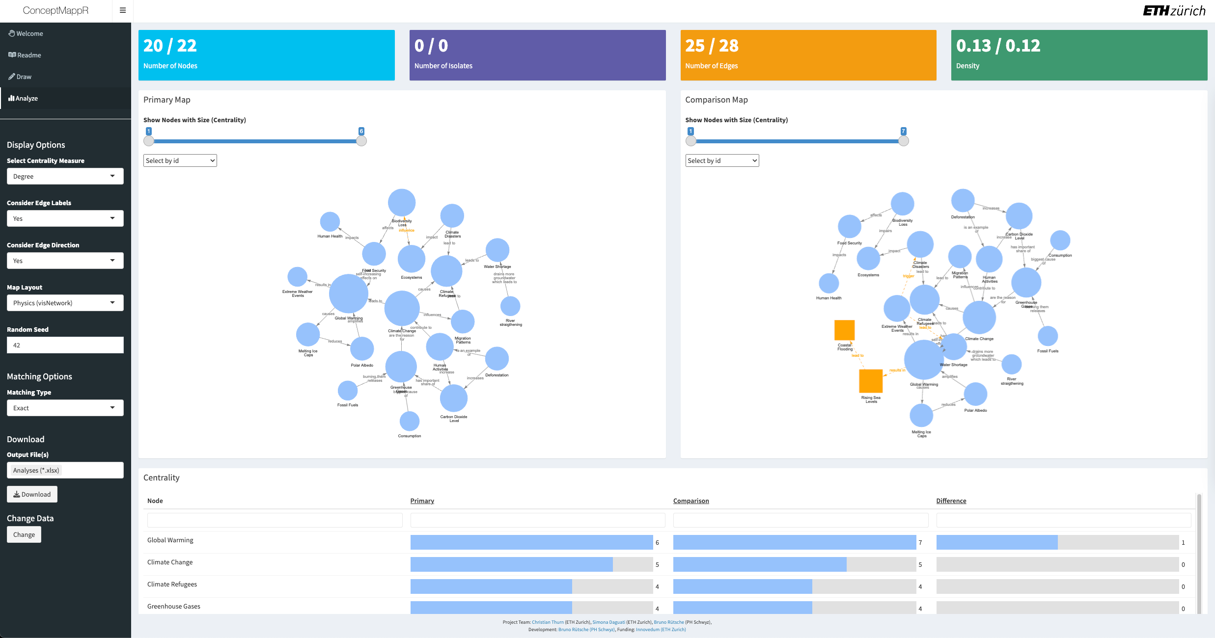
The main area on the right now shows several colored boxes. These will include information about the number of nodes, isolates (unconnected nodes), edge, and the density of the network. In each box, the values of the Primary File(s) are shown on the left and the values of the Comparison file (if available) on the right. More information will appear when moving your mouse cursor over each box.
The main area on the right also shows up to two interactive plots of your concept maps. In these plots, you can move and select nodes and edges as well as zoom in and out. The size of the nodes corresponds to the centrality measure you have selected (see Analysis: Centrality) and the thickness of the edges corresponds to the number of files containing each edge. Nodes that are unique to the Primary File(s), i.e. that do not appear in the Comparison File (and vice versa), are displayed as orange squares. Similarly, unique edges are displayed as orange, dashed lines.
The main area on the right shows one or several interactive tables. In these tables, you can sort and filter the data as required. The 'Centrality' table shows the centrality of each node and if available, the (absolute) difference between the Primary File(s) and the Comparison File. The 'Analysis by File' table shows for each Primary File how many nodes and edges are shared with the Comparison File. The 'Analysis by Nodes' table and 'Analysis by Edges' table show for each node or edge how often they appear across all Primary Files. More information about each column will appear when moving your mouse cursor over the column names.
Analysis: Centrality
Centrality measures are used to identify critical or important nodes in a network but they differ in how this 'importance' is calculated:
- Degree Centrality: This calculates the number of adjacent edges of each node.
- Betweenness Centrality: This calculates the shortest paths between all pairs of nodes in your map, i.e. the minimum number of steps one has to take to connect one node to another, and indicates how many of these shortest paths pass through each node. It can be seen seen as a measure of dependence of a network on a given node.
- Closeness Centrality: This is the inverse of the sum of all shortest paths between each node and all other nodes in your map. It can be seen as a measure of node efficiency, i.e. how 'quickly' you reach all other nodes.
Analysis: Matching Options
These options allow you to decide how the Primary File(s) is/are matched to the Comparison File. Note that the values in the Primary File(s) are replaced with the matching values of the Comparison File. The values in the Comparison File are seen as the 'reference' and thus are never changed. When uploading multiple Primary Files, they are matched individually to the Comparison File; they are never matched to each other.
These are the available options:
-
'Exact': Nodes and edges are matched only if they are identical (e.g., 'DNS' in the Primary File is matched to 'DNS' in the Comparison File but not to 'DNA').
-
'Case Insensitive': Nodes and edges are matched even if they differ in case (e.g., 'protein' is matched to 'Protein')
-
'Approximate': Decide how 'close' nodes and edges are allowed to be to still be matched.
This option uses the Levenshtein distance to count the number of deletions, insertions, and substitutions that are necessary to turn the values from the Primary File(s) into the values of the Comparison File.
The suboption 'Matching By' allows you to select whether to only match the nodes or to match nodes AND edges.
The suboption 'Max. Distance' allows setting the maximally allowed distance. For example, if the distance is set 1, 'DNA' and 'DNS' will be matched, since the former can be changed into the latter by substituting the letter 'A' with a 'S'.
Analyses: Selecting Nodes / Edges
When multiple Primary Files are uploaded, a slider to select nodes and edges is displayed in the sidebar on the left. The slider allows restricting the analysis to nodes and edges based on the number of Primary Files they appear in.
For example, when uploading 6 Primary Files and selecting a range from 2 to 6, nodes and edges appearing only once across all files are removed, while nodes appearing at least twice are retained.
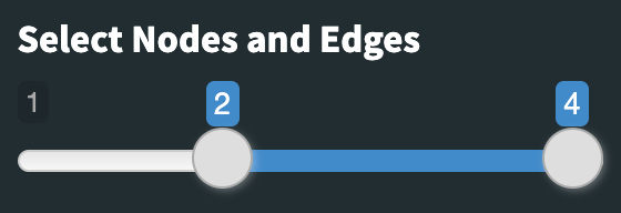
After first initialization, the default range of the slider is set to show the average number of edges across files (i.e., total number of edges / number of uploaded files).
This option affects all further analyses since the unselected nodes / edges are removed completely beforehand (e.g., it affects the number of nodes, number of edges and centrality values).
Data Storage
ConceptMappR temporarily saves the uploaded concept map(s) for visualization and analysis purposes only, ensuring that no data is stored long-term, and all information is automatically deleted as soon as the session is closed.
Help
There are several ways to receive help:
First, please refer back to this page if you are unsure about the usage of the dashboard or the interpretation of the analyses.
Second, we have placed several helpful tooltips throughout the dashboard. If you hover over a box, button or text, the answer you are looking for might immediately be shown.
Third, as a student, please contact your teacher for questions about the content of the maps. If you experience any technical issues or if have questions about network analysis in general, please contact Christian Thurn.
Acknowledgements
ConceptMappR is built using R which is a free environment for statistical computing and visualization. In addition to base R, ConceptMappR relies among others on the following packages: conflicted, DiagrammeR, DiagrammeRsvg, dplyr, htmltools, igraph, reactable, readr, readxl, rjson, rsvg, shiny, shinyBS, shinydashboard, shinyjs, shinyWidgets, stringdist, stringr, tibble, tidyr, tippy, visNetwork, writexl and xml2.
Many thanks to all the dedicated developers!
Draw
- Please download the drawing regularly in case of unexpected crashes (e.g., connection dropouts). It is recommended to use the map structure (i.e. *.cxl file) which when reuploaded recreates the drawing including the formatting and positions.
- Select multiple nodes or edges by long-clicking or using Ctrl / Cmd + click.
- Shortcuts: 'N' to add nodes, 'E' to add edges, 'double click' on nodes / edges to edit, 'D' to delete